SPACE AHEAD: Setting and Audience
At the beginn of “SPACE AHEAD” you should actively consider how, where and to whom you present your data. Let’s take a look at why this matters and why slapping your figure from a paper onto a presentation slide might not be the best approach.


If you’re wondering, what “SPACE AHEAD” stands for, take a look at this summary.
General considerations
Complexity, level of detail and accompaining explanations or annotations should fit the setting and the target audience.
Using a well known chart type, that is common in your research field, makes the visualization easier to comprehend. On the other hand, research methods, computational power and dataviz tools evolved over time, while people still use visualizations invented in the 1950s (boxplot), or even further back in 1801 (pie chart). That’s not to say, that these techniques are bad. On the contrary, one could argue, that they “stayed” and became the standard, because they were best fit / versatile in the scientific progress.
The first concepts leading to the boxplot were introduced by Mary Eleanor Spear in her 1952 Book “Charting Statistics”, where she used interquartile range boxes. Years later, John Tukey added the whiskers in the 1970s. (see here and here)
In 1801, William Playfair, a Scottish engineer and statistics/dataviz pioneer (among many other “occupations”), first used pie charts in a publication. He demonstrated the proportions of the Turkish Empire located in Europe, Asia and Africa respectively.
Yet, as technology and methods progress, why shouldn’t there be an evolution in data visualization as well? Especially since psychological studies of perception and processing of visual information delivers findings on what works better in certain situations1–3. These results can be leveraged to deliver the same data in a more comprehensible way.
Let’s look at this exampleby Cédric Scherer: Boxplots might be a good tool to present summary statistics for a broader audience at a conference. But they may hide critical information that could lead to new insights, when discussing the data with colleagues. When you have time to look at / present detailed/raw data, you might see unexpected patterns.
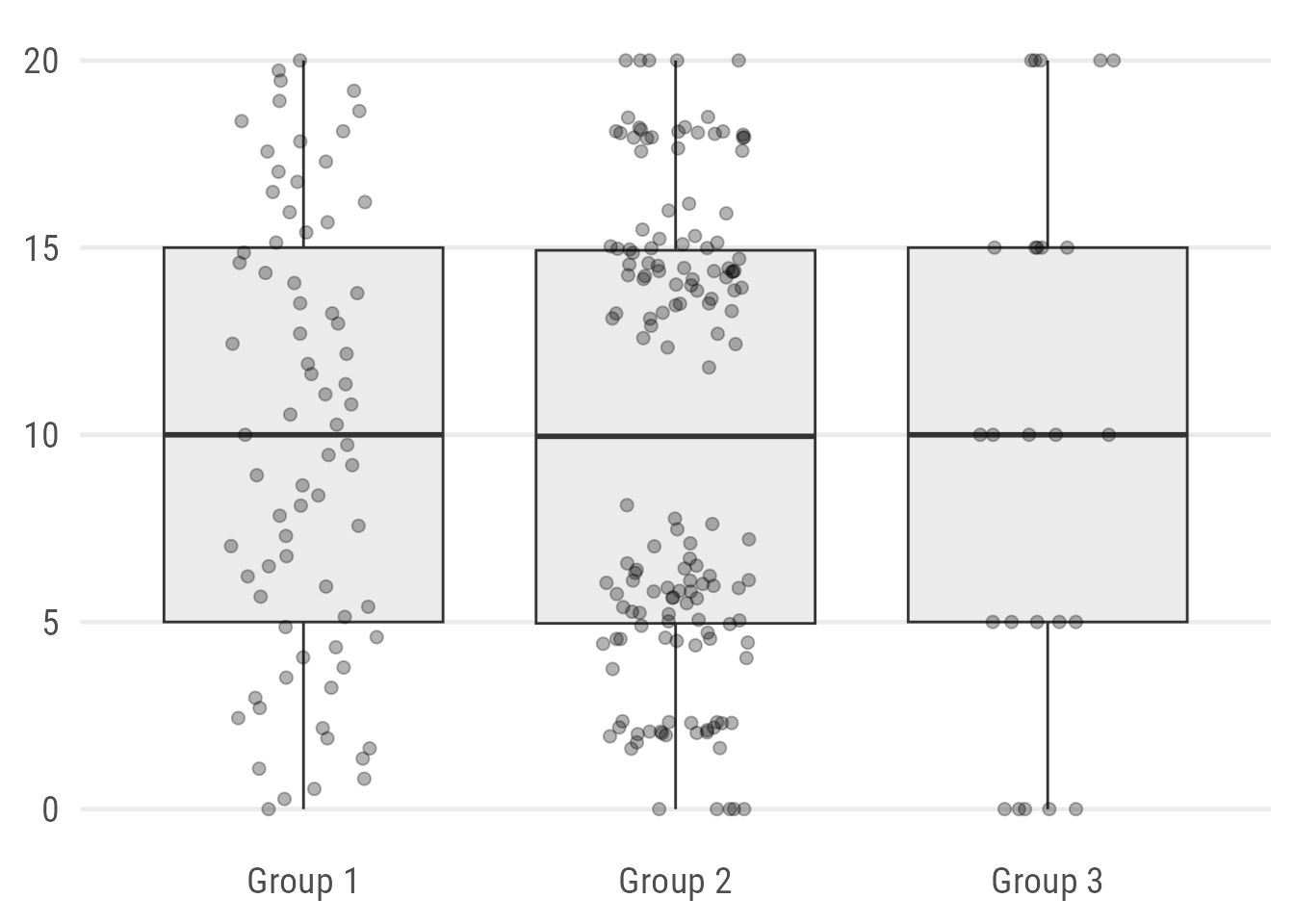
I highly recommend reading Cédric’s blog post on this matter. He presents a better / modern alternative to simple boxplots to show distributions and summary statistics.
The same goes for other common charts, such as a piechart, dynamite plots, etc. If you’re interested in modern alternatives for what you want to present, take a look at the visual vocabulary that gives ideas on how to plot the data. Another good source of inspiration is Data-to-Viz. If your software can’t make one of these charts, you can check out RAWGraphs, which offers a vast variety of diagrams in a user-friendly interface.
In summary, if the setting allows to spend extra seconds / words on explaining an innovative chart first and then showing the data, you might be able to present your data in ways that are not possible with the “default chart types”.
Setting + Audience
These two categories are closely connected, but still worth being considered separately:
Setting defines the situation where the data is presented (e.g. a small conference, your local lab meeting, an invited key note lecture, teaching), but also the mediumrepository of your group,…)
Audience is rather self explanatory: like, do you communicate to other domain experts, early career scientists / students, a broader scientific community, policy-makers or the general public?
These categories can be combined in different ways, each time influencing how the data is best presented.
The same audience might expect different things, depending on the setting and thus focus their attention accordingly. As an example (audience == scientists), the same data might be presented differently in an invited keynote vs. in a poster walk 1 or at a Science Slam.
Within the same setting (e.g. an oral presentation at a conference), charts might have different requirements depending on the target audience: a group of interested domain experts vs. early career scientists from a broader background. Or maybe you want to convince that one policy maker that is sitting in the audience.
What’s the Take Away
When you take these principles to real-world applications, there are many details and considerations to take into account, many ways to combine Setting and Audience. Surely I cannot provide recommendations for each and every setting and scientific field. However, thinking about how, where and to whom you present may help you to deliver a clearer message in a (more) powerful way.
- Who will listen to / read this? What are their expectations? What do they know already?
- Is the chart type established in the target audience?
- Can the chart be accompained by comprehensive explanatory text (in a paper), less text (poster) or will I just brush over it in a short talk?
- What do I want to achieve with the chart: Underpin a specific claim to convince someone? Tell a complete story? Document data in a way that allows precise lookup/readout2?
- What’s the expected reading distance for this very chart? 25cm (in a printed paper), 1-2m (conference poster), >10m (oral presentation)? Chose font size, contrasts and level of detail accodingly.
References
Footnotes
Reuse
Citation
@misc{gebhard2023,
  author = {Gebhard, Christian},
  title = {SPACE {AHEAD:} {Setting} and {Audience}},
  date = {2023-11-15},
  url = {https://christiangebhard.com/posts/2023-10-space-ahead-dig-down},
  langid = {en}
}