
# load libraries needed for both ways
library("tidyverse")
library("rnaturalearth")
library("rnaturalearthdata")
library("ggtext")
library("patchwork")

library("showtext")
font_add_google("Cabin Sketch")
font_add_google("Open Sans")
showtext::showtext_opts(dpi = 300)
showtext_auto()Integrating tables in plots
Including a table in a graph can be very informative. Unfortunatley that wasn’t very straight forward in {ggplot2} - until now. I revisit one of my plots for #30DayChartChallenge to showcase how to include a {flextable} into a plot using {patchwork}.
maps
tables
R
Intoduction
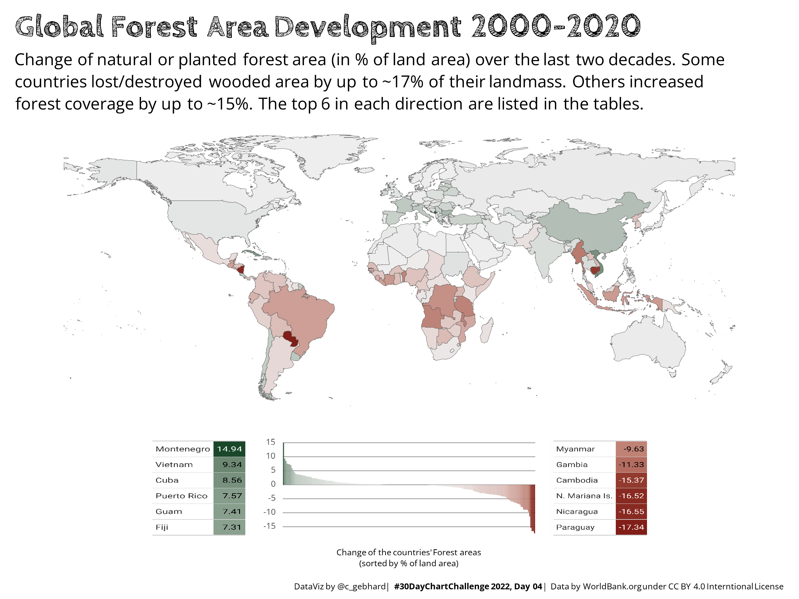
Back in April 2022, I was able to submit a few plots to the #30DayChartChallenge on Twitter. On Day 4 I needed to include two tables in the plot to list / highlight the head/tail of the countries regarding forestation development.
I couldn’t find any way to directly integrate a table into a plot object1. The ‘solution’ that worked to meet the deadline was to
- render the tables with
{gt}/{gtExtras}, - export them as PNG to disk,
- read the PNG back in,
- set it as background image of a otherwise blank plot and then
- integrate this plot into the main map.
Recently {flextable} introduced an option to output a table as “grid graphic”, which is directly interoperable with {ggplot2} and {patchwork}.
In this post I revise my initial plot to showcase this approach to include a table in a {ggplot2} chart. At the time of writing, this was only available in the development version >= 7.4 of the package.
Note
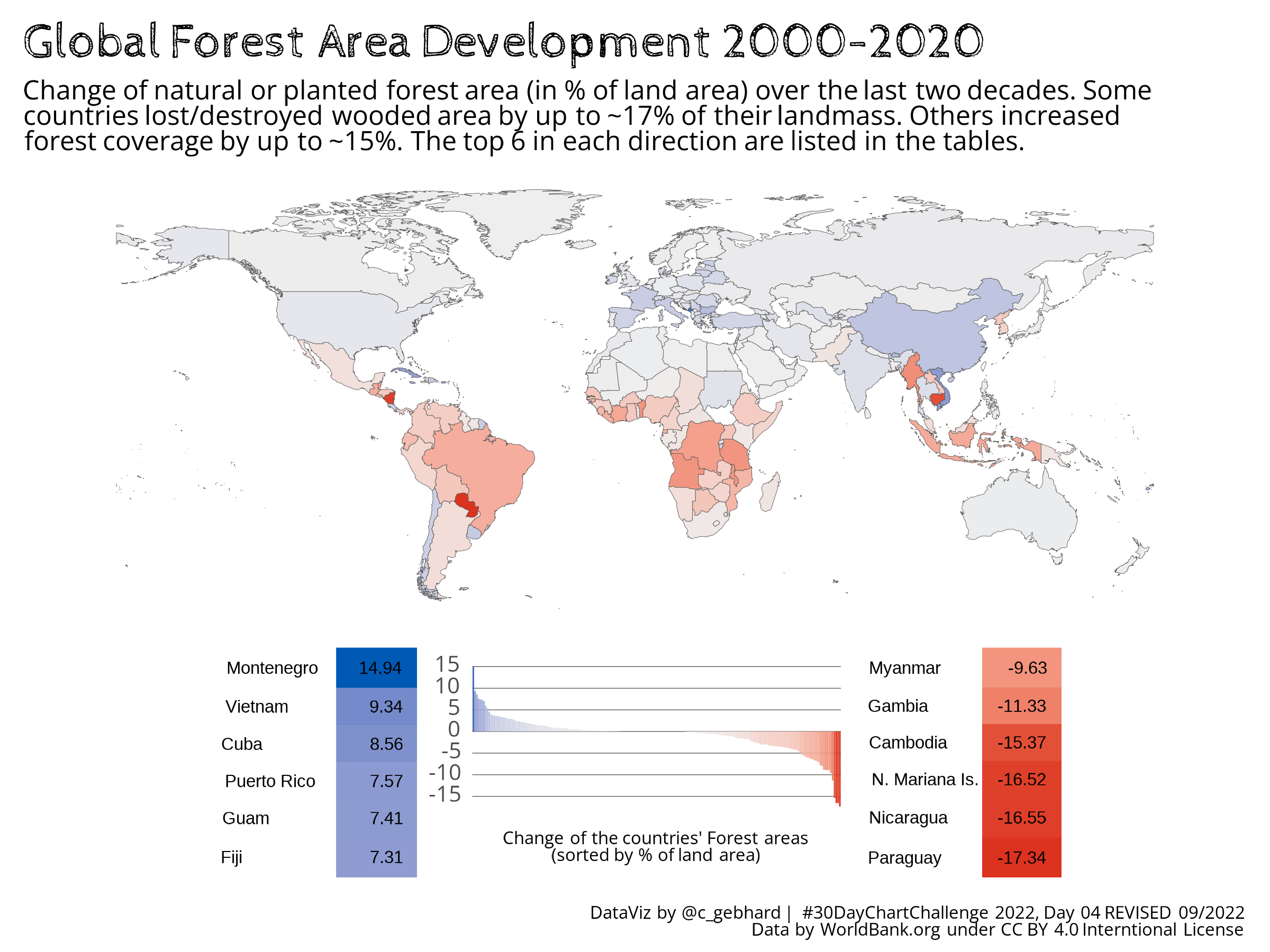
While revising, I changed the color-palette to a colorblind friendly palette. I initially used green to match the day’s theme of ‘flora’. I didn’t realize, that I ended up with a red/green diverging palette that made it really hard for some viewers to differentiate.
Image credit for the preview picture: Debby Hudson on Unsplash
Yet Another Note
This post does not compare the features or qualities of either table packages in general. This is a very specific use-case where {flextable} now offers a very handy feature.
Setup and Data
Read and prepare data
The data comes from World Bank, published under the CC BY 4.0 International License. The data was obtained on 2022-03-23. Forest area is land under natural or planted stands of trees of at least 5 meters in situ, whether productive or not, and excludes tree stands in agricultural production systems (for example, in fruit plantations and agroforestry systems) and trees in urban parks and gardens.
# read data
forestation <- read_csv(here::here("data", "worldbank", "forestation_tidy.csv")) |>
  pivot_wider(id_cols = c(country_name, country_code), names_from = Year, values_from = surface, names_prefix = "y") |>
  mutate(surface_diff = y2020 - y2000)

# read map data from rnaturalearth
world <- rnaturalearth::ne_countries(scale = "medium", returnclass = "sf")

# join forestation data to the map data
world_forestation <- world |>
  left_join(forestation, by = c("iso_a3" = "country_code")) |>
  filter(iso_a3 != "ATA") # Antactica is removed due to missing data to save space on the map
Plot the map and the legend
# plot the world
pworld <- ggplot(data = world_forestation) +
  geom_sf(aes(fill = surface_diff), size = 0.1) +
  scale_fill_gradient2(low = "#DC3220", high = "#005AB5", mid = "#EEEEEE", na.value = "#FFFFFF") +
  theme_classic() +
  labs(
    title = "<b>Global Forest Area Development 2000-2020<b>",
    subtitle = "Change of natural or planted forest area (in % of land area) over the last two decades. Some<br>countries lost/destroyed wooded area by up to ~17% of their landmass. Others increased<br>forest coverage by up to ~15%. The top 6 in each direction are listed in the tables."
  ) +
  theme(
    text = element_text(family = "Open Sans"),
    plot.title = element_markdown(family = "Cabin Sketch", size = 22),
    plot.subtitle = element_markdown(family = "Open Sans", size = 12, lineheight = 0.4),
    axis.line = element_blank(),
    axis.text = element_blank(),
    axis.ticks = element_blank(),
    legend.position = "none"
  )

# plot the legend plot
legend_plot <- world_forestation |>
  filter(!is.na(surface_diff)) |>
  ggplot() +
  aes(
    x = reorder(iso_a3, -surface_diff),
    y = surface_diff,
    fill = surface_diff
  ) +
  geom_bar(stat = "identity") +
  scale_fill_gradient2(low = "#DC3220", high = "#005AB5", mid = "#EEEEEE") +
  scale_y_continuous(
    breaks = c(-15, -10, -5, 0, 5, 10, 15),
    labels = c("-15", "-10", "-5", "0", "5", "10", "15")
  ) +
  labs(
    caption = "Change of the countries' Forest areas<br>(sorted by % of land area)"
  ) +
  theme_classic() +
  theme(
    text = element_text(family = "Open Sans"),
    axis.line = element_blank(),
    axis.ticks = element_blank(),
    axis.text.x = element_blank(),
    panel.grid.major.y = element_line(color = "black", size = 0.1),
    panel.background = element_blank(),
    plot.background = element_blank(),
    legend.position = "none"
  ) +
  theme( # text styling
    plot.title = element_blank(),
    plot.caption = element_markdown(family = "Open Sans", size = 8, hjust = 0.5, lineheight = 0.4),
    axis.title.y = element_blank(),
    axis.title.x = element_blank(),
    axis.text.y = element_markdown(family = "Open Sans", size = 10)
  )

# define plot layout for later patchwork
layout <- "
AAAAAA
AAAAAA
AAAAAA
#BCCD#
"
Select head and tail of the dataset
# countries with largest increase in surface area
top6 <- as_tibble(world_forestation) |>
  filter(!is.na(surface_diff)) |>
  select(name, surface_diff) |>
  arrange(desc(surface_diff)) |>
  mutate(surface_diff = round(surface_diff, 2)) |>
  head(6)

# countries with lowest increase / maximum reduction of surface area
low6 <- as_tibble(world_forestation) |>
  filter(!is.na(surface_diff)) |>
  select(name, surface_diff) |>
  arrange(surface_diff) |>
  mutate(surface_diff = round(surface_diff, 2)) |>
  head(6) |>
  arrange(desc(surface_diff))
Integrating the tables
Next you’ll find the two ways to include tables into a patchworked chart.
# libraries needed for this variant
library("flextable")
# obtain maximum and minimum values for the color scale
a.max <- max(top6$surface_diff)
a.min <- min(low6$surface_diff)
# set font size
set_flextable_defaults(
font.size = 8
)
# render head and tail of the list as flextable with conditional coloring
top6.flex <- top6 |>
flextable::flextable() |>
bg(
j =2,
bg = scales::col_numeric(
palette = c("#DC3220","#EEEEEE", "#005AB5"),
domain = c(a.min, a.max)
)
) |>
delete_part(part = "header") |>
border_remove() |>
autofit() |>
gen_grob(fit = "auto", scaling = "min", autowidths = FALSE,
just = "center")
low6.flex <- low6 |>
flextable::flextable() |>
bg(
j =2,
bg = scales::col_numeric(
palette = c("#DC3220","#EEEEEE", "#005AB5"),
domain = c(a.min, a.max)
)
) |>
delete_part(part = "header") |>
border_remove() |>
autofit() |>
gen_grob(fit = "auto", scaling = "min", autowidths = FALSE,
just = "center")
# compose patchwork
patched.flex <- pworld + top6.flex + legend_plot + low6.flex +
plot_layout(design = layout) +
plot_annotation(
caption = "<br><span >DataViz by @c_gebhard | #30DayChartChallenge 2022, Day 04 <b>REVISED 09/2022</b><br>Data by WorldBank.org under CC BY 4.0 Interntional License</span>",
theme = theme(
plot.caption = element_markdown(family = "Open Sans", size = 8),
)
)
# save patchwork
ggsave(
here::here("posts", "2022-09-09-flextable-in-graphs", "2022_04_rev.png"),
plot = patched.flex,
height = 6,
width = 8,
dpi = 300
)# libraries needed for this variant
library("gt")
library("gtExtras")
library("png")
library("ggpubr")# render gt tables
good6 <- top6 |>
gt() |>
gt_color_rows(surface_diff,
palette = c("#EEEEEE", "#005AB5"),
domain = c(0, 14.94)) |>
tab_options(
column_labels.hidden = TRUE
)
bad6 <- low6 |>
gt() |>
gt_color_rows(surface_diff,
palette = c("#DC3220","#EEEEEE"),
domain = c(0, -17.34)) |>
tab_options(
column_labels.hidden = TRUE
)
# store gt tables as PNGs
gtsave(
bad6,
here::here("posts", "2022-09-09-flextable-in-graphs", "bad6.png"),
zoom = 10
)
gtsave(
good6,
here::here("posts", "2022-09-09-flextable-in-graphs", "good6.png"),
zoom = 20
)
# read PNGs from file
bad6_img <- readPNG(
here::here("posts", "2022-09-09-flextable-in-graphs", "bad6.png"),
native = TRUE
)
top6_img <- readPNG(here::here("posts", "2022-09-09-flextable-in-graphs", "good6.png"), native = TRUE)
# set PNGs as background of otherwise empty plots
bad6_plot <- ggplot() +
background_image(bad6_img) +
coord_fixed()
top6_plot <- ggplot() +
background_image(top6_img) +
coord_fixed()
# compose patchwork
patched <- pworld + top6_plot + legend_plot + bad6_plot +
plot_layout(design = layout) +
plot_annotation(
caption = "<br><span>DataViz by @c_gebhard | <b>#30DayChartChallenge 2022, Day 04</b> | Data by WorldBank.org under CC BY 4.0 Interntional License</span>",
theme = theme(
plot.caption = element_markdown(family = "Open Sans", size = 8),
)
)
# save patchwork
ggsave(
here::here("posts", "2022-09-09-flextable-in-graphs", "2022_04.png"),
plot = patched,
height = 6,
width = 8,
dpi = 300
)To be honest, the number of code lines is not that much different. However, if you look at the steps/packages needed, there is a clear advantage of the {flextable} variant. The improvement becomes even more apparent, when you look at the output.
Compare the output
These are the rendered charts from the above code. The first image2 is the {gt} version, that was also submitted to the #30DayChartChallenge (except this one is with colorblind friendly colors). The table is pixelated and the aspect ratio somewhat distorted, so that the text doesn’t look very sharp. Obviously you could improve this by refining the layout, so that the table PNGs don’t get distorted, the DPIs of the table PNGs could be improved, etc. But all this means manual adjustment, that needs to be repeated, once you change the overall chart layout or rearrange the patched-subplots.
The second figure is the {flextable} variant, that overcomes these issues by including the tables into the plot object and thus the output is rendered with the same PNG settings as the rest of the plot. Sure, there are minor issues, that I could not fix at the moment either3, but the overall look is much better. And as I haven’t used {flextable} before, there might be ways to properly fix these issues quickly, that I don’t (yet) know of.

Conclusions
Both, {flextable} and {gt} are powerful table tools. Both have a vast variety of options and neither is ‘generally better’. The new feature in {flextable} makes inclusion in graphs much more handy and allows for a higher quality outcome compared to the above workflow of saving the tables as PNG and then including that in the plot.
If you know of other ways to accomplish this task, please let me know in the comments. I’d be happy to learn other ways to use tables in charts!
Footnotes
Reuse
Citation
BibTeX citation:
@misc{gebhard2022,
  author = {Gebhard, Christian},
  title = {Integrating Tables in Plots},
  date = {2022-09-09},
  url = {https://christiangebhard.com/posts/2022-09-09-flextable-in-graphs/2022-09-09-flextable-in-graphs.html},
  langid = {en}
}
For attribution, please cite this work as:
Gebhard, Christian. 2022. “Integrating Tables in Plots.”
September 9, 2022. https://christiangebhard.com/posts/2022-09-09-flextable-in-graphs/2022-09-09-flextable-in-graphs.html.