

library(pixture)
pixgallery(
list.files("assets/challenges_images",
full.names=TRUE),
dim="350px",
gap = "10px"
)Switching to quarto
I recently ported my blog to quarto. In this post I highlight the key features, that I like about quarto and that I implemented for this website.
meta
Updates
- 2023-01-14
- Minor text refinements; made tip regarding HTML indentation more prominent, as some readers gave feedback regarding its importance; adds giscus to section regarding comments; adds academicons to list of quarto extensions.
Introduction
#Rstats twitter is full of @quarto_pub lately. Seeing this new framework only as a successor of Rmarkdown would do it injustice. It is developed by RStudio1 and aimed to allow scientific publishing of many sorts: reports for print, interactive documents, presentations, websites … and blogs!
I made the choice to switch this blog over from {distill}, as quarto implemented many small improvements that I wanted, but that were hard/impossible to implement with {distill}.
“Quarto® is an open-source scientific and technical publishing system built on Pandoc” – quarto.org
I will describe in detail, how I got from the minimal/default quarto blog2 to how this blog looks and works now. This includes: adding a dark theme, tweak both themes with (S)CSS, custom pages for projects / data viz gallery, quarto extensions, font self-hosting and many other smaller things.
In this post I will not give a thorough walk-through of how to build a quarto website from scratch or how to port a {distill} blog to quarto. There are several great blog posts who do this already and I mainly used these two to get started myself:
- Porting a distill blog to quarto by Danielle Navarro
- The ultimate guide to starting a Quarto blog by Albert Rapp
And of course there’s the extraordinarily good official documentation of quarto. I consulted it quite frequently and almost always found what I was looking for.
If you like how jollydata.blog looks and feels and you want to adapt some of that, I recommend following one of the posts above to get you started and then coming back here to take some of the details that you want.
Note before continuing
In the following chapters I assume that you know the project structure of a quarto website/blog, and have a rough understanding of what some of the files such as _quarto.yml or _metadata.yml do.
Themes
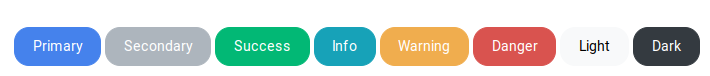
Quarto comes with a large number of themes for websites, that allow for easy changing of the overall look and feel. The themes come from the bootswatch project and cover a wide range of styles, from colorful to white, from round to sharp, from light to dark,…Nearly everyone should find something to their liking. When the themes don’t hit just the spot you want, it is easy to tweak them – at least if you have some basic CSS or SCSS knowledge.
Selecting the theme(s)
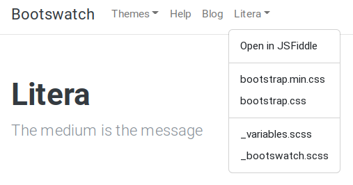
As main theme I chose “litera” with a clean and mostly white design. To set the theme, simply specify its name in the _quarto.yml file:
format:
  html:
    theme: litera
Even if I enjoy the bright design, a reader might prefer a dark theme. Fortunately, quarto offers a built-in theme-switcher in the Navbar. This activates the alternate theme on all pages of the blog, as long as the reader switches back. To activate it I simply had to explicitly define a light and a dark theme (see below on the left), which (after rendering) puts a switch-icon in the navbar (see below on the right):
format:
  html:
    theme:
      light: litera
      dark: superhero
Aligning the themes
I could have stopped here and enjoyed the view already. However, minute differences between the bright and dark themes caught my eye, namely default theme colors and element borders. If you compare the two themes, below you’ll notice different shapes and colors:

Switching themes would therefore also change the form and colors of the buttons, search boxes, highlights, callout-boxes etc. To align the styles I had to specify certain SCSS variables.
Each bootswatch theme comes with a set of default variables that define colors, sizes, margins, borders, shapes and so on. All themes use the same variable names for each design element. By specifying certain variables in a custom add-on theme file, I could override design details in both themes at the same time and therefore align the look and feel. To do this, one can add a file to the project directory e.g. mystyle.scss with the following basic content:
/*-- scss:defaults --*/

// default values go here (e.g. certain variable values that should replace theme-defaults)

/*-- scss:rules --*/

// further CSS rules for specific HTML tags go here
To align “litera” and “superhero” I took the colors from superhero and added them to my custom jollydata.scss file. This overrides the default “litera” theme-colors. In addition I removed any “border-radius”, which added the round corners on buttons and other website elements:3
/*-- scss:defaults --*/

// Colors

$red:     #d9534f !default;
$yellow:  #ffc107 !default;
$green:   #5cb85c !default;
$cyan:    #1bc7dc !default;

$success:       $green !default;
$info:          $cyan !default;
$warning:       $yellow !default;
$danger:        $red !default;

// Button styling
$btn-border-radius:           0em !default;
$btn-border-radius-lg:        0em !default;
$btn-border-radius-sm:        0em !default;

/*-- scss:rules --*/

// remove radius of the large buttons on the about page
div.quarto-about-trestles .about-entity .about-link {
  border-radius: 0;
}

// remove radius on the bootstrap "cards" element (more on that later)
.card {
  border-radius: 0;
}
To include these adjustments to the blog I added the custom SCSS file to my _quarto.yml like so:
format:
  html:
    theme:
      light: [litera, jollydata.scss]
      dark: [superhero, jollydata.scss]
By doing this, the themes respect the common style elements defined by jollydata.scss, but still use the rest of their respective light/dark design-scheme.
Tweaking the themes even further
Apart from the above I made several small adjustments, mostly going below the /*-- scss:rules --*/. Instead of detailing all of that, I’ll explain how I proceeded with two examples:
To specify default variables I looked through the variable list on the theme’s website. When you download and look at the _variables.scss, you can see what you can adapt to your liking:
These defaults (that go to the /*-- scss:defaults --*/ part) could be e.g. $font-size-base, $body-color, $headings-font-weight, etc.
To change specific HTML elements, I open the site-preview in my web browser, right-click the element and “examine” them in the browser’s “devtools”. They tell me the “class” of the object. In this case the figure caption has the class figure-caption:
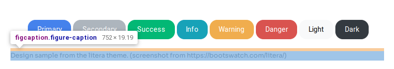
Under /*-- scss:rules --*/ I added classic CSS rules to define the look. E. g. , for figure captions I chose a smaller font size:
.figure-caption {
  font-size: 0.8rem;
}
BYOF (bring your own font)
Bootswatch themes come with default fonts. I wanted to give jollydata.blog a unique look. The blog’s main font now is Sora. It has a characteristic and sharp look, that I like, quite similar to Atkinson Hyperlegible. In the legacy {distill} version of my blog I had two different fonts (Bitter and Open Sans) to style headings and body text respectively.
In my opinion Sora presents different typographic features at body text size and at heading size that gives enough contrast while keeping a unified look across all text elements.
To embed a font in your custom .scss file you can link to Google Fonts, which is very convenient to implement:
/*-- scss:defaults --*/

// import google fonts
@import url('https://fonts.googleapis.com/css2?family=Courier+Prime&family=Fira+Code&family=Roboto+Mono:wght@300;400&family=Sora:wght@300;400;500;600;700;800&display=swap');

// use Sora font if available
$font-family-sans-serif:  "Sora", sans-serif !default;
And that’s it. The website should now use the above font as default. However, I chose to self-host the fonts. That means that I stored them on my hosted web-space and instruct the readers’ browsers to pull them from there (same as the rest of the website) instead of from fonts.google.com.
Why? Well, according to a quite recent court ruling in Germany, it is problematic if a website using Google Fonts redirects a reader to fonts.google.com in the background without prior consent. That might cause GDPR implications, that I’m not willing to risk.4.
If you like a certain Font from fonts.google.com and want to self-host, you could check out the following tool, which helps you get up and running easily: Web Fonts Helper. Make sure the font’s license is respected properly and allows you to host your own copy.
Important Disclaimer
I’m not a lawyer and I do not give any legal advice here, whatsoever. The above is my personal interpretation of what I read on the web and I chose to self host according to this. I’m not recommending either of the options presented in this section, but instead recommend you search proper legal advice if you are concerned about this. You’re proceding at you own risk regarding this. In no event shall I be held liable for any claim, damages or other liability arising from the implementation of the above font-related code or use of the Web Fonts Helper tool.
Switching figure backgrounds
Having a dark mode option might introduce a “problem” when your plots have a bright background. They will contrast with the dark theme’s dark page background. Thankfully, smart people have already figured out a way to circumvent this. For example there is this neat solution by Lisa DeBruine.
The idea is to have two versions of the plot (one with a dark background and one with a bright background) and only showing what fits the current blog theme, while hiding the other one. I will not implement this retrospectively for old posts, but will try to do so in upcoming publications.
Custom pages
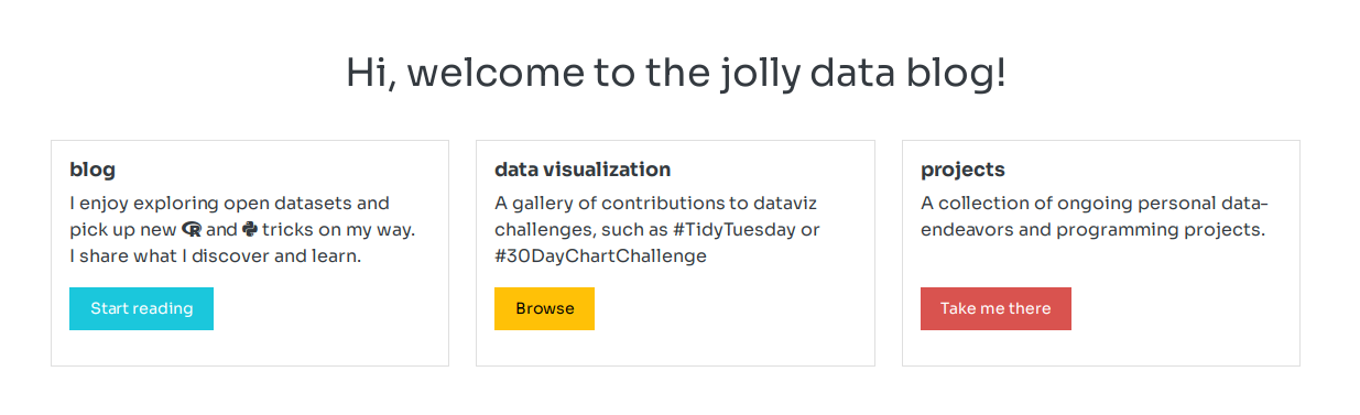
Quarto - by default - sets the posts-listing as index page, when you start a new blog project. To give credits to my other projects, I designed a custom landing page for https://jollydata.blog, where the blog is presented next to those other projects. So in my case, in addition to the post listing there is a “Projects” page and a “Data Viz Gallery”, as well as an “About” page.
Responsive Web Design
I’m not a web developer and chances are, you’re neither. quarto gives us a hand by providing easy means to leverage the Bootstrap CSS Grid System. Kudos to Albert Rapp, who details this in an extensive section of his post and gives directions on how to use this feature for responsive website design. I used his code as inspiration and combined it with elements from the bootswatch themes to implement the “Cards” on my landing page and on my project page.
I can only recommend to check out the bootswatch theme documentation to get inspired by HTML elements that are ready to be used in a custom website such as landing pages or other special websites of your blog:
I built my projects page by copying and adapting the code for the “Cards” object. Hovering a theme element on the “litera” page shows a button on the top right that opens a pop-up with the HTML-code:
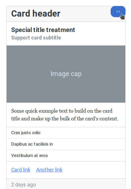
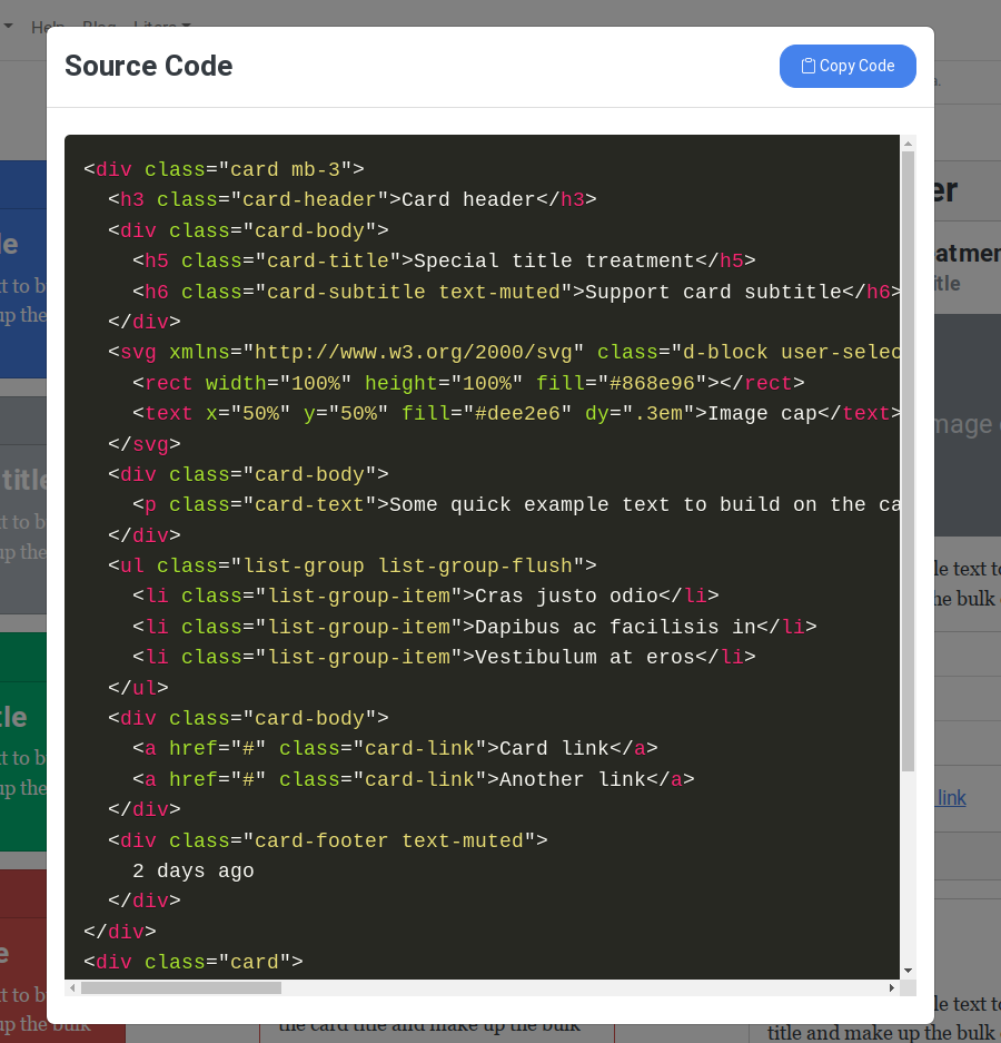
Quarto, such as RMarkdown did, understands HTML code. Just put it in the document, where you want to have the element.
Avoid time consuming debugging:
Be cautious with line indentation within qmd files. You should not indent the HTML code: it might look better while coding, but it might not be interpreted correctly by quarto.
As this is taken from the bootsatch project, they provide proper styling within their themes. So these objects play well with the blog’s light and dark theme. For example my projects page and the code now looks like this:
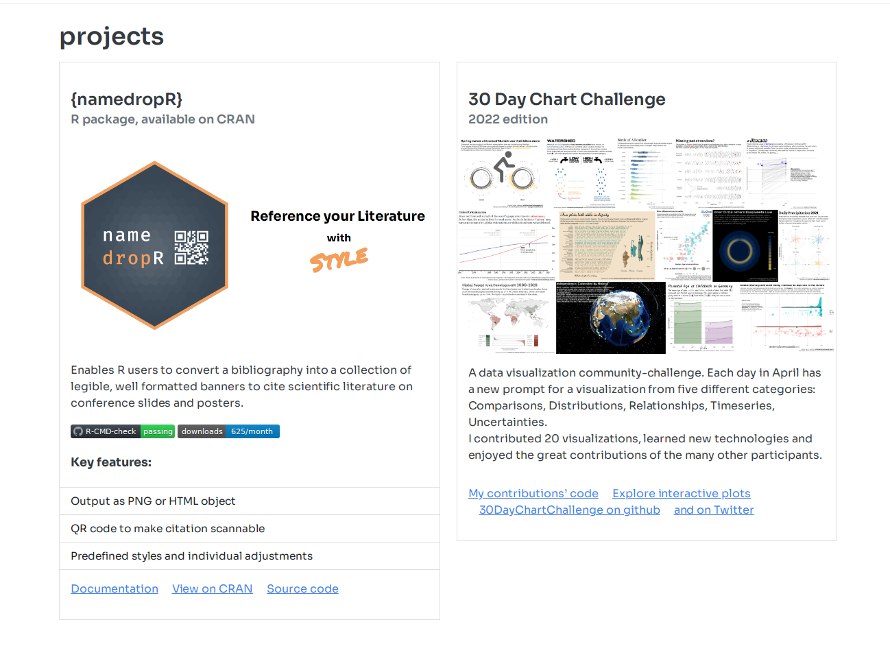
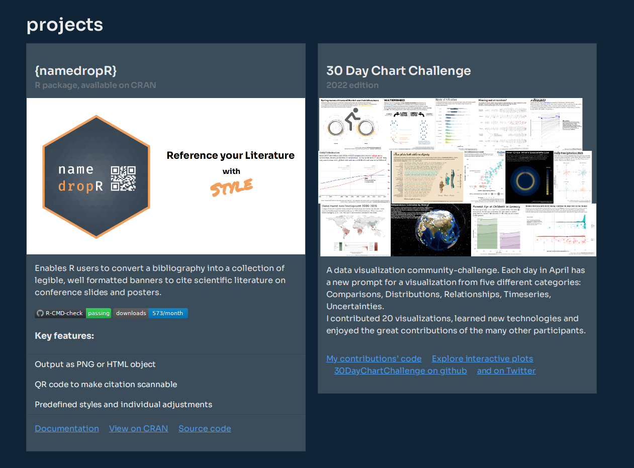
As you can see below, I adapted the “Cards” cody by changing the title, the list items, the image source etc. and wrapped each card inside a grid element. Each card now spans the whole horizontal space (12/12 theoretical columns) on small screens and half of the horizontal space on medium/larger size screens (6/12 theoretical columns). There is no need to define any CSS style here, as all that is already defined in the theme that you load for the rest of the website. Whatever element you take from bootswatch.com should be defined/styled already.
---
title: "projects"
comments: false
page-layout: full
---

::: {.grid}
::: {.g-col-12 .g-col-md-6}

<div class="card mb-3">
<div class="card-body">
<h3 class="card-title">{namedropR}</h3>
<h6 class="card-subtitle text-muted">R package, available on CRAN</h6>
</div>
<img src="assets/images/namedropR_slide.png"/>
<div class="card-body">
<p class="card-text">Enables R users to convert a bibliography into a collection of legible, well formatted banners to cite scientific literature on conference slides and posters. </p>
<img src="https://github.com/nucleic-acid/namedropR/workflows/R-CMD-check/badge.svg" alt="R-CMD-check" style="max-width: 100%;"> <img src="https://cranlogs.r-pkg.org/badges/namedropR" alt="Monthly Downloads">
<br><br>
<h5>Key features:</h5>
</div>
<ul class="list-group list-group-flush">
<li class="list-group-item">Output as PNG or HTML object</li>
<li class="list-group-item">QR code to make citation scannable</li>
<li class="list-group-item">Predefined styles and individual adjustments</li>
</ul>
<div class="card-body">
<a href="https://nucleic-acid.github.io/namedropR/" class="card-link">Documentation</a>
<a href="https://cloud.r-project.org/package=namedropR" class="card-link">View on CRAN</a>
<a href="https://github.com/nucleic-acid/namedropR/" class="card-link">Source code</a>
</div>
</div>

:::

::: {.g-col-12 .g-col-md-6}

<div class="card mb-3">
<div class="card-body">
<h3 class="card-title">30 Day Chart Challenge</h3>
<h6 class="card-subtitle text-muted">2022 edition</h6>
</div>
<img src="assets/images/chartchallenge2022.png"/>
<div class="card-body">
<p class="card-text">A data visualization community-challenge. Each day in April has a new prompt for a visualization from five different categories: Comparisons, Distributions, Relationships, Timeseries, Uncertainties.<br>
I contributed 20 visualizations, learned new technologies and enjoyed the great contributions of the many other participants.</p>
</div>
<div class="card-body">
<a href="https://github.com/nucleic-acid/30DayChartChallenge_2022" class="card-link">My contributions' code</a>
<a href="https://jollydata.blog/posts/2022-04-15-30daychartchallenge-interactive-plots/" class="card-link">Explore interactive plots</a>
<a href="https://github.com/dominicroye/30DayChartChallenge_Edition2022" class="card-link">30DayChartChallenge on github</a>
<a href="https://github.com/nucleic-acid/30DayChartChallenge_2022" class="card-link">and on Twitter</a>
</div>
</div>

:::

:::
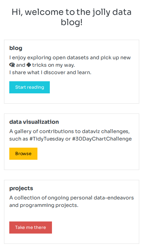
The same principle was used for the landing page, but with simpler “cards”. They follow the theme design and are floating elements in a responsive design:
Data Viz Gallery
This was already present in the Rmarkdown-based version of my blog. Luckily the code runs as smooth in quarto, as it did before. The heavy-lifting is done by the {pixture} package by Roy Francis.
This package basically takes a folder with images as input and generates a beautiful image gallery including JavaScript code that allows full screen swiping through the pictures.
The implementation for my gallery consists of a few lines of code:
404-error page
This is quite a self-explanatory section. You can basically design a custom page and put it e.g. in your projects root directory. You need to specify at your web hoster’s settings, what page should be displayed, if a reader opens a non-existing page of your blog. Check out quarto’s documentation about further details on this. To inspect my 404-page, go ahead and follow this broken link.
Importing existing blog posts
Porting an RMarkdown blog to quarto should be quite straight forward – and it most certainly is. At least in most of the cases.
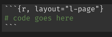
The R code is evaluated in the same way as it is in RMarkdown. I ran into a few frequently arising issues, mostly linked to layout options, that were used by {distill} but break quarto’s renderer. This required some manual tweaking and re-running of all the old posts. The process is still ongoing and I’ll post updates on problems and solutions here:
Output layout
In {distill} you specified the output of a code chunk via chunk options, such as layout="l-page":
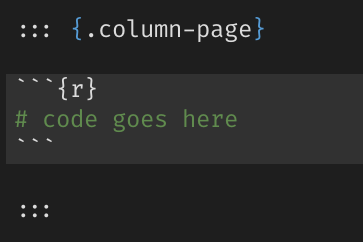
In quarto the layout is specified by wrapping the code chunk into a .column-* DIV:
Keep those old URLs alive!
The new quarto blog might have a different URL structure than your previous one. To keep old URLs valid (e.g. if they were shared somewhere), you can specify “alias” URLs in each post’s YAML header. This generates a small HTML file in that old location that links to the new/correct URL. You’d best check out the excellent quarto documentation on this.
If your blog is hosted on Netlify, you might want to check out Danielle Navarro’s Chapter on that.
Unsorted collection
In this last section I collect a few features, that I implemented / activated as well. I’ll only list them here, as there is great documentation of them already out there:
- Quarto extensions: these are definitely worth keeping an eye on. By opening quarto for extensions, Rstudio provided the space for creative and helpful tools that enrich the new ecosystem. Currently implemented for this blog are: Fontawesome Icons, Academicons for the ORCiD icon & Grouped Tabsets
- Comments functionality can be added by either utterances, giscus (which I use) or hypothes.is. Quarto’s developers did a great job to make this as easy as adding three lines to
_quarto.yml:
  comments:
    giscus: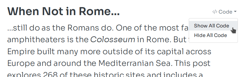
repo: nucleic-acid/quarto-blog- Code options: When you read one of my blog posts, you might notice a code-switcher right next to the title. It allows the reader to expand or collapse all code chunks in the post, depending on the reader’s interests:
To use this, simply add the following to your _quarto.yml:
format:
  html:
    code-fold: true
    code-tools:
      toggle: true
      source: false
There are even more options for this described in the quarto documentation. In this case, I decided to use “toggle” but not “source”.
Closing remarks
The quarto framework is quite exciting and already offers many possibilities for technical and scientific publishing. In porting my blog, most of the time consuming work was needed to adapt (and re-run) the existing blog posts.
Let me know in the comments, if you found other exciting quarto extensions or features that could be added to the post above!
Footnotes
Reuse
Citation
BibTeX citation:
@misc{gebhard2022,
  author = {Gebhard, Christian},
  title = {Switching to Quarto},
  date = {2022-08-06},
  url = {https://christiangebhard.com/posts/2022-08-06-_switching-to-quarto/switching-to-quarto.html},
  langid = {en}
}
For attribution, please cite this work as:
Gebhard, Christian. 2022. “Switching to Quarto.” August 6,
2022. https://christiangebhard.com/posts/2022-08-06-_switching-to-quarto/switching-to-quarto.html.