
After three months of sailing, it is time to adjust the rigging. A refreshed look with a custom color palette, a custom ggplot2 theme and an updated logo and new typography.
Back, when I started, I made some initial design decisions (fonts, a few colours, logo). Other things were deliberately left in their default setting, in order to get the blog finally started without loosing myself in constant optimising before launch. The important steps before launch were setting up the web hosting and understanding how the distill blogging tool works.
Now after three posts I have some ideas on how to improve the overall appearance of the blog and to streamline the writing of the posts. In this section I will describe how I adjusted the fonts, the colour palette of the blog and for plotting and how I set up a custom basic ggplot2 theme, that I can simply apply to all plots.
My initial choices for the fonts were some of my favorite font families: Cabin (sans serif) for body text and plots, Crimson Pro (serif) for headings and Inconsolata (mono) for code chunks.
While this had a classy look1, after some time now I felt it was a bit “too classy”, as in old-fashioned. I want the blog to have a serious yet modern look and feel. One of the most direct ways to achieve this is a set of fonts that play well together and represents the idea of the post.
After some playing around I settled on
The blog basically needs only two colors: the dark color for the nav-bar / the footer and an accent color that will (for now) be used in the logo and might later be used for some stylistic accents in the text.
![]()
As you can see in the image above, the dark color was changed from a dark blue to a dark slate with only a decent hue of blue (I called it dark_slate). The accent color changed from a darker, crimson-ish red to a brighter tone that is more a salmon-like orange (I called it humble_salmon).3
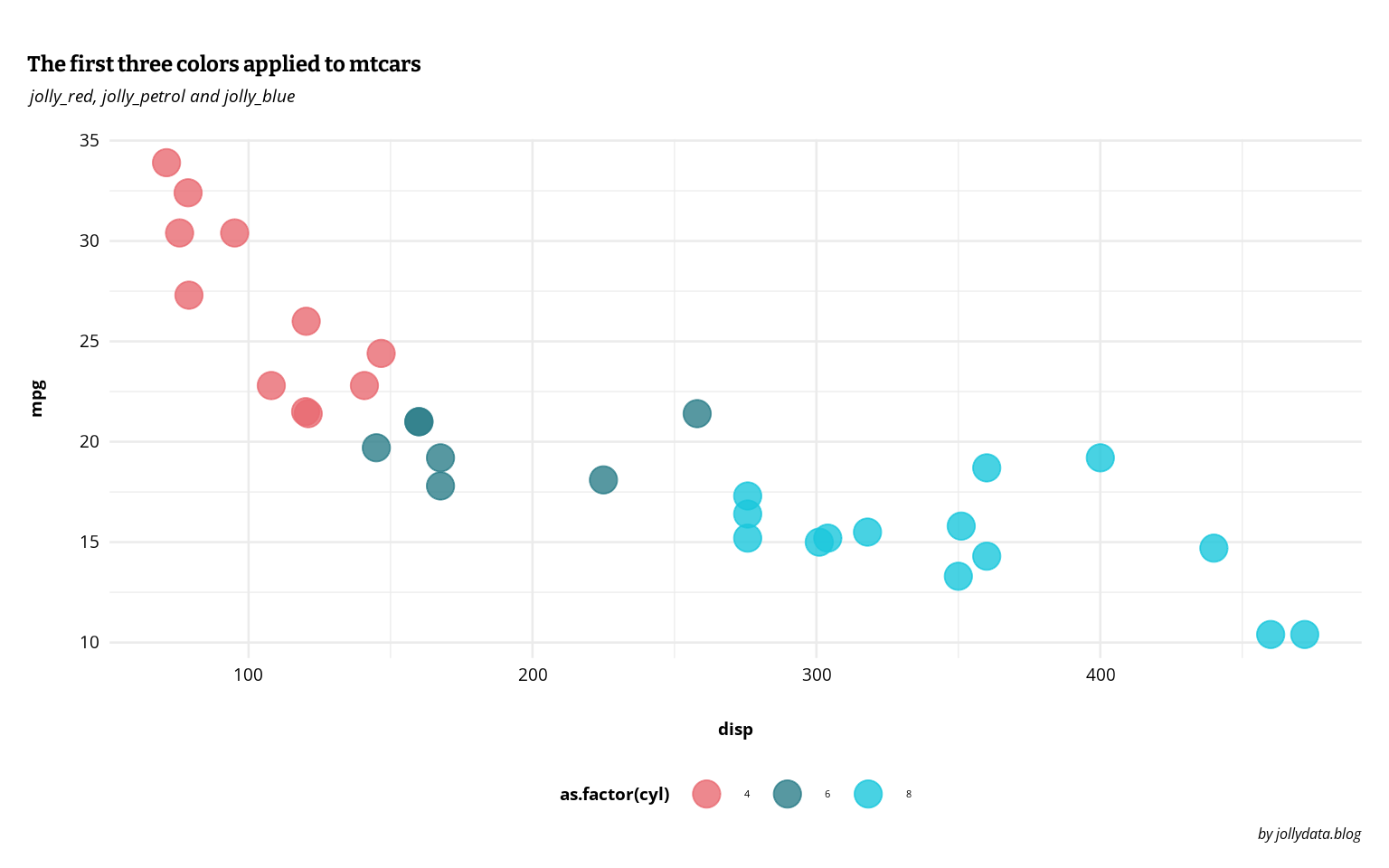
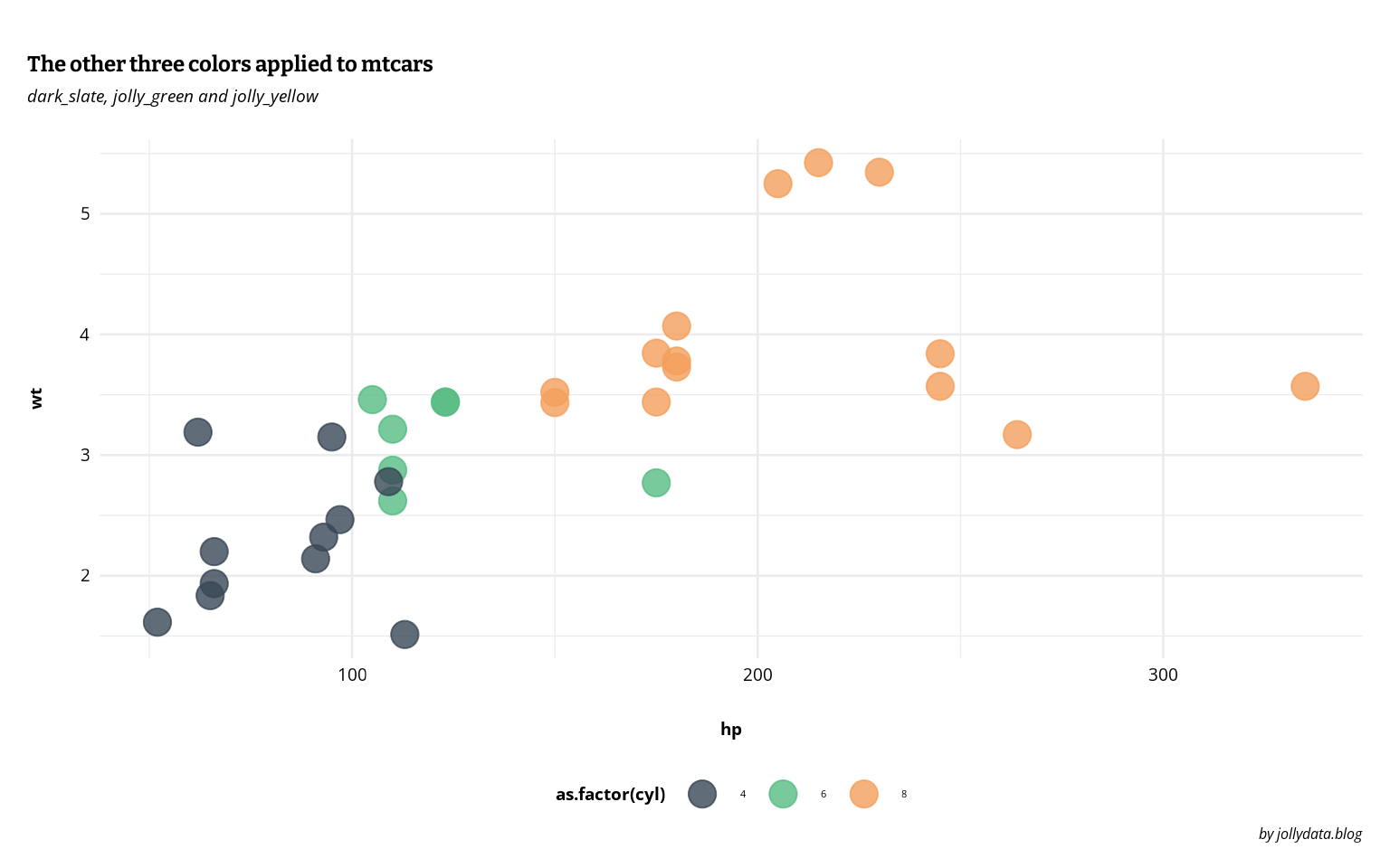
For plotting I needed more colors. I built a palette that has components in all major color “directions” (red: jolly_red, blue: jolly_petrol & jolly_blue, green: jolly_green and yellow: jolly_yellow) to allow for all plotting needs. For now I only defined a few base colors and will use variations on them if I need them in special plots.
These are the colors in action:
In the first post I used a color_brewer palette and didn’t change the theme_minimal() much. After that I developed a look, that I liked and used it in the second post. But since then I always had to manually copy the custom theme, which was quite error prone and I probably never was completely consistent.
This is why I wanted to streamline the process of writing by creating a custom theme. I used two blog posts as inspiration for how to achieve this: https://www.r-bloggers.com/2018/09/custom-themes-in-ggplot2/ and https://themockup.blog/posts/2020-12-26-creating-and-using-custom-ggplot2-themes/.
I now wrote a custom theme-function called “jolly_theme()” based on theme_minimal(), that I can conveniently call when needed (as I did in the two plots above) and still tweak it to the specific plot, if needed.
library("ggplot2")
library("showtext")
font_add_google("Bitter")
font_add_google("Open Sans")
showtext_auto()

jolly_theme <- function(
  base_size = 12,
  base_family = "Open Sans"
){
  theme_minimal(base_size = base_size,
                base_family = base_family) %+replace%
  theme(
    plot.title = element_text(
      family = "Bitter",
      face = "bold",
      size = rel(1.8),
      hjust = 0,
      vjust = 10),
    plot.subtitle = element_text(
      face = "italic",
      size = rel(1.8),
      hjust = 0,
      vjust = 8
    ),
    plot.caption = element_text(
      size = rel(1.2),
      face = "italic",
      hjust = 1
    ),
    plot.margin = margin(1.5, 0.4, 0.4, 0.4, unit = "cm"),
    axis.title = element_text(
      face = "bold",
      size = rel(1.4)),
    axis.title.x = element_text(margin = margin(t = 15, r = 0, b = 0, l = 0)),
    axis.title.y = element_text(margin = margin(t = 0, r = 15, b = 0, l = 0), angle = 90),
    axis.text = element_text(
      size = rel(1.4)),
    legend.position = "bottom",
    legend.title = element_text(
      face = "bold",
      size = rel(1.4)
    ),

    complete = TRUE
  )
}

# store colours for comfortable plotting

humble_salmon <- "#EC836D"
dark_slate <- "#394755"
jolly_red <- "#E86B72"
jolly_petrol <- "#2D7F89"
jolly_blue <- "#1BC7DC"
jolly_green <- "#56BB83"
jolly_yellow <- "#F39F5C"
In the same R-script I defined my new color palette. Whenever I write a new post, I include the following line in the setup chunk and can then call the colors and the custom theme by their names.
source("../../resources/jolly_theme.R", local = knitr::knit_global())The blog got an update in the visual appearance. I will come back to this post and add sections, as soon as I find time to apply the theme and color palette to a python template. If I define a nice palette on one of the main colors, I might add this here as well. If you’re into typography as well and want to have a chat about font pairings, feel free to contact me via twitter or mastodon.
@online{gebhard2021,
  author = {Gebhard, Christian},
  title = {With Flying Colours},
  date = {2021-03-09},
  url = {https://christiangebhard.com/posts/2021-03-09-with-flying-colours/with-flying-colours.html},
  langid = {en}
}